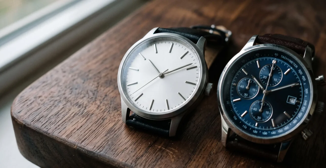
A refined watch dial does not necessarily have fewer details. It has a clearer visual hierarchy. The hands are easy to distinguish, the hour markers have room to breathe, and decorative elements support rather than compete with the time display. Even a complicated dial can appear carefully composed when its proportions, contrasts and finishes work together.
The difference becomes especially apparent when comparing watches at similar prices. One may use applied markers, a subtle texture and discreet lettering to create a coherent impression. Another may combine several attractive details but struggle to establish a single focal point. The first often feels more polished, even without expensive materials or elaborate decoration.
For buyers, the useful question is not simply whether a dial looks minimal. It is whether every element contributes to legibility, balance or a deliberate aesthetic. Evaluating those qualities at normal viewing distance, under different lighting and on the wrist makes it easier to distinguish genuinely considered design from visual complexity that looks impressive only in photographs.
What defines a refined watch dial?
- Clear visual hierarchy matters more than the number of elements: hands, markers and secondary details should not compete for attention.
- Proportion and execution determine quality: consistent spacing, controlled typography and carefully finished surfaces make simplicity convincing.
- Judge the watch on your wrist and in realistic lighting, not solely through enlarged product photographs.
- Why Does Dial Simplicity Make Some Watches Look More Expensive?
- How Can You Judge Watch Dial Balance Before Buying?
- Minimalist or Complicated Dial: Which Works Better for Everyday Wear?
- The Dial Design Mistake That Can Make a Watch Look Cluttered
- When Does Dial Design Matter Most for a Dressier Watch?
- How Can You Choose a Classic Watch That Fits Your Wrist Properly?
- Traditional Sports Watch or Smartwatch: Which Better Fits an Active Routine?
- What Makes a Classic Watch Versatile Enough for Everyday Wear?
Why Does Dial Simplicity Make Some Watches Look More Expensive?
Dial simplicity can make a watch appear more expensive because it directs attention toward details that reveal the quality of its execution: marker alignment, hand proportions, surface finishing and the space between elements. With fewer distractions, careful craftsmanship becomes more noticeable. However, a minimal layout only creates a premium impression when those remaining details are convincingly designed.
Consider two watches with plain silver dials and three hands. One has precisely aligned applied indices, consistently spaced minute markings and hands whose lengths complement the dial. The other uses unevenly weighted printing, disproportionate hands and a logo positioned awkwardly above the center. Both are minimalist, but the first looks substantially more considered.
This explains why visual restraint is not a shortcut to quality. Removing elements increases the importance of those that remain. A slightly misplaced date window or excessively wide minute track may become more distracting on an otherwise empty dial than on a complex chronograph.
Finishing introduces another distinction. Applied markers can create subtle shadows and depth, while printed markers can look equally elegant when their line weight and placement are controlled. Neither approach automatically establishes superiority. The relevant question is whether the treatment complements the overall composition.
Decorative techniques can also demonstrate craftsmanship without requiring a crowded layout. The Victoria and Albert Museum‘s explanation of guilloché enamelling describes how mechanical engraving and translucent enamel produce intricate surface effects. Such decoration illustrates the distinction between technical ornament and visual clutter: a detailed surface can remain harmonious when the time display is clearly organized above it.
Classic dress-watch conventions reinforce the association between restraint and refinement. Slim hands, uncomplicated displays and discreet hour tracks form a familiar visual language associated with formal watches. Yet historical watchmaking was not uniformly minimalist.
For example, The Metropolitan Museum of Art‘s historical watch catalogue documents a seventeenth-century watch by Jacques Goullons with elaborate enamel decoration and a single hand indicating hours and half-hours. The object demonstrates that sophisticated ornament and a relatively simple time display can coexist. It does not establish that simpler designs are inherently more valuable.
A sparse dial can also appear unfinished. Large empty areas, weak contrasts or decorative textures used without a coherent purpose may make the design feel inexpensive rather than refined.
Ultimately, simplicity exposes design quality; it does not create it. The next question is how to recognize that quality systematically before purchasing.
How Can You Judge Watch Dial Balance Before Buying?
Judge watch dial balance through three viewing distances: normal arm’s length for overall harmony, a quick glance for legibility, and close inspection for alignment and finishing. Then assess the watch on your wrist. A well-balanced dial should present the time clearly, distribute its visual elements coherently and remain proportionate to the case.
Begin by looking at the complete watch rather than concentrating on individual details. Notice where your eyes settle first. Ideally, the hands and principal hour markers establish an immediate reference, while the brand name, date and secondary markings remain subordinate.
Next, inspect the distribution of visual weight. Balance does not require perfect symmetry: a date window at three o’clock can work beautifully if the other elements compensate for it. The test is whether one side of the dial appears disproportionately crowded or empty.
Useful checkpoints include:
- Index spacing: hour markers should follow a consistent rhythm, even when some are replaced by numerals or complications.
- Alignment: date windows and subdials should relate deliberately to the hour markers, central hands and surrounding tracks.
- Upper and lower balance: logos, model names and additional text should not make one half of the dial visually heavier without a clear design reason.
- Margins: sufficient space around the hour circle prevents markers and printing from feeling squeezed against the bezel.
- Hand distinction: the hour and minute hands should remain distinguishable against the background.
Product photography can conceal these weaknesses. Enlarged studio images emphasize decorative finishing, while carefully arranged reflections may flatter a dial that is difficult to read in ordinary light. Check the watch under indoor lighting, near a window and, where possible, in dimmer conditions.
Finally, place the watch on your wrist and view it naturally. A broad dial in a large case may appear open and elegant in isolation but oversized when worn. Conversely, a compact watch can make a detailed display feel organized if the markers, hands and complications are scaled appropriately.
A five-step dial inspection before buying
- Check immediate readability. Look at the watch at arm’s length and record whether you can identify the time without consciously searching for the hands.
- Identify the focal point. Note the first three elements that attract attention and confirm that the time display has priority.
- Inspect the layout. Compare index spacing, date alignment and dial margins; write down any imbalance you notice.
- Test different lighting. Compare readability in bright and indoor light, noting any reflections, low-contrast markings or disappearing hands.
- Assess the wrist fit. Put the watch on with its intended strap and record whether the case, lugs and dial appear proportionate from a normal viewing angle.
A watch that passes these checks has a stronger practical case for everyday ownership, whether its dial is minimalist or complicated.
Minimalist or Complicated Dial: Which Works Better for Everyday Wear?
A minimalist dial generally offers greater versatility and faster time reading, while a complicated dial can be more useful if its additional functions serve your routine. Neither is automatically better for everyday wear. The deciding factor is whether the information you regularly consult justifies the additional visual complexity and any reduction in immediate legibility.
A simple three-hand watch works across a wide range of situations because little competes with its primary purpose. It can be read during a conversation, while moving between appointments or when checking the time discreetly. Restrained styling also makes it easier to pair with different clothes.
A chronograph, by contrast, may provide useful elapsed-time measurement. A date display can save a separate check of a phone or calendar. These features earn their space when they are genuinely useful to the wearer.
One practical way to compare the two approaches is a cost-of-glance test. Look at each dial briefly, then ask how quickly you found the information you needed. Extra markings do not necessarily slow reading, but poorly differentiated scales, hands and subdials can create additional interpretation work.
For example, imagine two hypothetical watches. The first has a black dial with contrasting hands and a small date at three o’clock. The second uses several subdials, multiple scales and hands of similar color and shape. If all you need is the current time, the first will likely feel simpler to operate. If you regularly time activities, the second may offer more practical value despite its denser display.
The distinction between functional and decorative complexity is important. A functioning chronograph used frequently can justify its controls and registers. Nonfunctional subdial-style elements or layers of texture added solely to suggest technical sophistication may become less appealing once their novelty fades.
Clothing also influences the choice. A densely marked sports chronograph often brings a technical, casual character to an outfit, while a restrained dial can transition more naturally between a sweater, office clothes and a tailored jacket.
However, minimalism can go too far. A design with almost invisible markers or hands that blend into the dial may sacrifice readability for aesthetic purity.
The goal is not to eliminate information. It is to prevent additional information from obscuring the essential function of telling the time.
The Dial Design Mistake That Can Make a Watch Look Cluttered
The most common dial design mistake is creating competing focal points rather than simply including too many elements. A prominent logo, an oversized date window, bright subdials and a strong surface texture may all demand attention simultaneously. When nothing clearly dominates, the time becomes harder to locate and the composition looks less controlled.
Consider a dial with modest hour markers, a large brand signature at twelve o’clock and a highly contrasted date window at three. Even without complications, the date and logo may compete more strongly than the hands. The problem is visual hierarchy, not the total element count.
One diagnostic is to examine the minute track and surrounding margins. If the hour markers nearly touch the outer chapter ring, and additional printing fills every available gap, the dial can feel compressed. Compare the width of the open space beyond the indices with the size of the indices themselves. There is no universal ideal ratio, but an abrupt lack of breathing room often signals a crowded composition.
Typography deserves similar scrutiny. A dial combining multiple numeral styles, several font weights and repeated lines of branding can feel fragmented. Consistent typography helps the eye interpret the display as one organized system.
Finishing can either strengthen or weaken the hierarchy. A matte surface behind polished hands may create useful separation. But aggressive sunray reflections, glossy applied markers and highly contrasted printed text can compete, especially under directional lighting. Even a relatively simple dial may look busy when too many surfaces reflect or attract attention differently.
A quick visual experiment helps reveal unnecessary emphasis: temporarily cover one secondary element while viewing the watch. If concealing the logo, date or decorative section immediately makes the layout easier to understand, that element may be competing too strongly. This does not automatically mean it should be removed; reducing its size, contrast or prominence could also restore balance.
Conversely, a complex dial with carefully grouped registers and consistent visual treatments can remain orderly. Subdials do not create clutter merely by existing. They become a problem when their relative prominence obscures the main hands or makes the information difficult to interpret.
A well-composed dial guides attention naturally. That principle becomes especially significant when the watch is intended for dressier occasions.
When Does Dial Design Matter Most for a Dressier Watch?
Dial design matters most on a dressier watch when the case, strap and overall silhouette are deliberately understated. With fewer sporty or decorative features competing for attention, hand shape, marker spacing, typography and surface finishing become central to the watch’s appearance. In formal settings, subtle coherence usually matters more than visual impact or technical complexity.
Traditional dress-watch design commonly uses slim hands, restrained hour indices, limited dial text and an uncluttered layout. Applied baton markers, elegant printed numerals or a fine minute track can all work when their proportions are appropriate.
A date window is not inherently unsuitable, but its placement and contrast deserve attention. An oversized, brightly framed date can disrupt an otherwise understated composition. Similarly, prominent luminous plots and thick sports-style hands may move the watch toward a more casual character.
These conventions are stylistic rather than mandatory. A dress watch can feature decorative engraving, textured finishing or unconventional markers while remaining elegant. What matters is whether the components reinforce a recognizable design direction.
Surface depth becomes particularly interesting in formal lighting. Lacquered dials can create smooth reflections, enamel can offer a distinctive visual surface, and engraved patterns can change appearance as the watch moves. These effects are best evaluated in person because photographs capture only selected lighting angles.
The technical demands of slim watchmaking provide useful context. WatchTime‘s article on ultra-thin watchmaking discusses the constraints involved in making thinner movements and cases, including component arrangement, rigidity and hand clearance. This helps explain why thin-watch construction can involve substantial engineering, although a slim profile alone does not prove superior dial finishing or justify a particular price.
Be cautious with designs that attempt to communicate formal elegance and rugged sports functionality with equal intensity. A thin case paired with oversized luminous numerals, bold chronograph registers and a heavily decorated surface may struggle to establish a consistent identity.
Such a hybrid can still work as a deliberate design choice. The issue arises when seemingly unrelated features are combined without a clear hierarchy.
Even the most elegant dial, however, depends on the size and shape of the watch that frames it.
How Can You Choose a Classic Watch That Fits Your Wrist Properly?
Choose a properly fitting classic watch by measuring your wrist and evaluating case diameter, lug-to-lug length, thickness and strap proportions together. The lugs should sit comfortably without extending beyond the flat portion of your wrist. A well-sized case helps the dial appear balanced, while an oversized watch can make an otherwise restrained design seem disproportionately large.
Start by measuring your wrist circumference at the position where you normally wear a watch, just behind the wrist bone. Then inspect the dimensions of the case rather than relying on its advertised diameter alone.
In particular, lug-to-lug length determines how far the watch extends across the wrist. Two watches with the same case diameter can wear very differently if one has long, straight lugs and the other has short, downward-curving lugs.
Victorinox‘s watch sizing and fit recommendations emphasize considering wrist measurements, lug-to-lug dimensions, thickness and strap width rather than diameter alone. Its guide presents 38–42 mm as a general case-diameter reference, not a universal requirement. Wrist shape, case geometry and personal preference remain important.
Thickness influences both comfort and presentation. A slimmer watch usually passes more easily beneath a fitted shirt cuff, while a thick case may stand noticeably above the wrist. That elevated profile can alter the viewing angle and make the dial feel more prominent.
Strap design also changes the perceived proportions. A broad, stiff leather strap can make a moderate case look substantial. A slimmer, more flexible strap may emphasize the elegance of the same dial. Integrated bracelets and rigid end links require particular attention because they can increase the effective distance across the wrist.
During a fitting, check the watch from above and from a natural side angle. Move your wrist and notice whether the case remains stable, the lugs follow your wrist comfortably, and the strap bends without creating awkward gaps.
The goal is not to achieve a predetermined numerical ratio. It is to find a relationship in which the case, dial, lugs and strap appear visually coherent and remain comfortable through ordinary movement.
With size and balance established, the remaining decision is whether the watch’s functions suit the activities for which it will be worn.
Traditional Sports Watch or Smartwatch: Which Better Fits an Active Routine?
A traditional sports watch generally suits an active routine focused on durability, immediate time reading and minimal charging requirements. A smartwatch is more appropriate when activity tracking, notifications, navigation or connected features are used regularly. Both can work well, but their displays are designed around different priorities: a fixed physical dial versus a configurable digital interface.
Traditional analog sports watches typically emphasize high-contrast hands, legible markers and practical controls. A rotating bezel, chronograph or other functional feature can add information without making the dial feel unnecessarily decorative.
A smartwatch uses a screen, so its visual density depends partly on the selected watch face. A simple digital face may show little more than the time, while a fitness-oriented layout can display activity metrics, calendar information, weather and notifications at once.
This creates an important distinction: physical dial design is largely fixed, while a smartwatch interface can often be adjusted to suit different situations. Nonetheless, a configurable screen is not automatically more readable. Small text, excessive complications and distracting notifications can introduce their own form of visual clutter.
The practical trade-offs become clearer when comparing daily requirements.
| Criterion | Traditional sports watch | Smartwatch |
|---|---|---|
| Primary strength | Time reading and dedicated watch functions | Connected information and digital activity features |
| Display | Fixed hands and physical markers | Configurable screen and watch faces |
| Power | Varies by movement; mechanical watches do not require charging, while quartz models generally use batteries | Generally requires periodic recharging |
| Fitness information | Depends on the model; conventional analog watches usually offer limited tracking | Can provide activity metrics and health-related measurements, depending on the device |
| Water and shock resistance | Model-dependent; some are purpose-built for demanding environments | Model-dependent; stated resistance and intended use must be checked |
| Formal clothing | Restrained analog designs may integrate more discreetly | Appearance varies with case, strap and selected interface |
For example, someone who runs regularly and uses pace, heart-rate and training records may gain considerable value from a smartwatch. Someone whose activity consists mainly of walking, commuting and outdoor recreation may prefer an analog sports watch if they do not need connected data.
A two-watch approach is also reasonable. A traditional watch can serve as the everyday accessory, while a smartwatch is used for exercise or specific activities. This does mean managing two devices, but it avoids forcing one watch to meet every functional and stylistic requirement.
Whichever type you prefer, versatility remains the broader consideration when choosing a watch intended to accompany most of your wardrobe and routine.
Key takeaways before choosing an everyday watch
- Prioritize a dial you can read immediately in the conditions where you most often check the time.
- Confirm that case dimensions, thickness and strap geometry complement your wrist and clothing.
- Decide which functions and design features you genuinely value, rather than paying attention only to how impressive the watch looks in photographs.
What Makes a Classic Watch Versatile Enough for Everyday Wear?
A classic watch is versatile enough for everyday wear when its dial remains legible across different lighting conditions, its proportions work with both casual and formal clothing, and its colors complement most of your wardrobe. Restrained details typically make this easier, although versatility also depends on comfort, practical durability and personal style.
Three design variables deserve particular attention: the dial, the case and the color scheme. A clear dial supports quick reading. A reasonably proportioned case works with different sleeves. A neutral palette reduces the chance that the watch clashes with clothing.
Silver, white, black and subdued blue are familiar options because they can complement many combinations of materials and colors. None is universally superior. A black dial might suit a wardrobe dominated by darker tones, while a silver or white dial can feel lighter and more formal.
Visual restraint makes a significant contribution to versatility. Oversized branding, highly aggressive textures or conspicuous decorative motifs can give a watch a strong personality, but they may also restrict the situations in which it feels appropriate.
A useful way to judge versatility is to imagine one watch in three settings:
- A work meeting: does the dial look composed and remain easy to read without drawing unnecessary attention?
- A casual weekend: does the watch feel comfortable and natural with relaxed clothing?
- A formal evening: do the case thickness, surface finishing and overall proportions work with dressier attire?
If the watch looks convincing in all three scenarios, it is a strong candidate for everyday versatility. If one situation requires substantial compromise, the design may be more specialized than it first appeared.
Versatility also has a cost in terms of visual personality. A distinctive oversized chronograph or unusually colored dial may be exactly what makes a watch enjoyable. Choosing a restrained alternative simply to maximize compatibility can remove the character that attracted you in the first place.
For buyers who want a single everyday watch, a measured balance is usually more practical than either extreme. A carefully finished dial with one distinctive detail can feel individual without becoming difficult to match.
Consider that detail in context. A restrained textured dial may offer enough interest to reward close inspection while remaining quiet at arm’s length. A small date window may add useful functionality without dominating the design. A moderate case with thoughtfully shaped lugs may improve both comfort and appearance.
Before buying, shortlist watches that fit your wrist and daily activities, then compare them in person if possible. Look for a dial that remains readable at a glance, rewards closer inspection and feels appropriate in the situations where you will actually wear it.
Do applied hour markers always look more luxurious than printed ones?
No. Applied markers introduce physical depth and can create attractive highlights, but well-executed printed indices can look equally refined. Alignment, proportion, contrast and consistency matter more than the manufacturing method alone. The most appropriate treatment is the one that supports the overall dial design.
Can a textured watch dial still look minimalist?
Yes. Minimalism concerns visual hierarchy as much as the absence of decoration. A finely textured dial can retain a restrained appearance when its pattern remains subordinate to the hands and hour markers. Problems arise when reflective effects or strong contrasts make the surface more prominent than the time display.
Does a date window make a watch dial less elegant?
Not necessarily. A discreet date window can complement a classic layout when its size, placement and color are carefully integrated. A large or strongly contrasting date display may interrupt the balance, particularly on a restrained dress watch. Judge its visual effect alongside its practical usefulness.
Why can the same watch dial look different in photographs and on the wrist?
Close-up photographs enlarge details and often use carefully controlled lighting. On the wrist, case diameter, viewing angle, reflections and the surrounding proportions change the impression. A dial that appears spacious in an isolated photograph can look crowded in an oversized case, while subtle finishing may become more attractive under natural light.
Is a more expensive watch guaranteed to have a better-designed dial?
No. Price may reflect movement construction, materials, finishing, manufacturing complexity or other factors, but it does not guarantee visual balance or readability. Dial refinement remains a design judgment. Compare alignment, legibility, finishing and overall coherence directly rather than using price as a substitute for inspection.