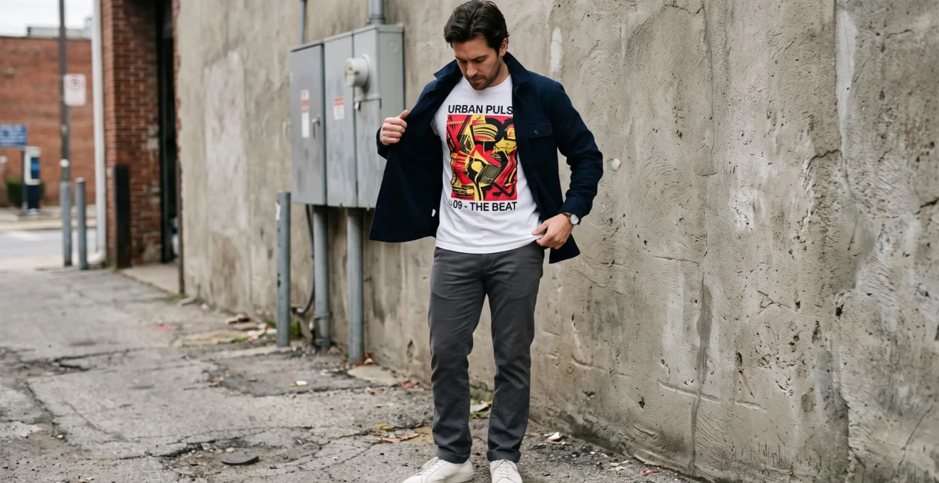
A graphic T-shirt can communicate personality before anything else in an outfit does. The challenge is making that expression feel deliberate rather than allowing prints, colours, proportions and accessories to compete for attention.
The simplest approach is to give the graphic one clear role. A large, high-contrast design can become the focal point, supported by solid-colour trousers, restrained footwear and an uncomplicated outer layer. A small logo or subtle illustration leaves considerably more freedom to experiment elsewhere.
That does not mean every outfit needs to be minimalist. Expressive, layered streetwear can look cohesive when its elements share a recognisable colour palette or visual theme. The important distinction is between combining details intentionally and adding them without considering their relationship.
From graphic scale and fabric fit to layering and day-to-night versatility, a few practical decisions can make printed tees easier to style without sacrificing individuality.
Graphic T-shirt styling: the essentials
- Let a bold graphic lead the outfit, then simplify the colours, patterns and accessories surrounding it.
- Use neutral trousers, complementary footwear and plain layers to control visual intensity.
- Choose graphic size and T-shirt fit according to your wardrobe, personal style and the setting.
- Why Does the Size of a T-Shirt Graphic Change How the Whole Outfit Feels?
- How Can You Style a Bold Graphic T-Shirt With Simple Trousers and Layers?
- Small Logo or Large Graphic: Which T-Shirt Works Better for Everyday Wear?
- The Styling Error That Makes Graphic T-Shirts Look Cluttered Instead of Intentional
- When Should a Graphic T-Shirt Be the Focal Point of Your Outfit?
- How Can You Tell If a Plain T-Shirt Fits Properly in 60 Seconds?
- Streetwear Brand or Fashion Label: What Actually Separates the Two?
- How Can Men Build an Urban Aesthetic That Works From Commute to Evening?
Why Does the Size of a T-Shirt Graphic Change How the Whole Outfit Feels?
The size of a T-shirt graphic changes how strongly it attracts attention and how much visual space it occupies. A large, contrasting print typically becomes a dominant feature, while a small logo leaves more room for other details. The effect also depends on print placement, colour contrast, garment fit and the surrounding clothes.
Think of a prominent graphic in the same way as a brightly patterned jacket. Both introduce visual weight: an element that attracts attention through scale, contrast or complexity. When that weight is concentrated in one garment, the rest of the outfit can provide a quieter background.
A large print across the chest may draw attention towards the torso and make that area appear more prominent. A compact chest logo generally has less influence on the overall silhouette. These are styling tendencies rather than fixed rules about how every body shape will appear.
Two characteristics are particularly useful when evaluating a printed tee:
- Graphic density: how much of the available fabric is covered by the design. A sprawling illustration containing several elements has greater density than a small isolated symbol.
- Graphic contrast: how distinctly the design stands out against the shirt. White lettering on black fabric may attract more immediate attention than a larger charcoal print on a dark grey tee.
These characteristics operate independently. A large tonal graphic can feel surprisingly restrained, while a tiny fluorescent logo may be highly noticeable. Judging both helps explain why two shirts with similarly sized prints can behave differently in an outfit.
A useful styling heuristic follows: the bigger and more contrasting the graphic, the fewer additional statement details you usually need. Large prints already establish much of the outfit’s visual direction. Small prints leave greater freedom for textured trousers, colourful jackets or more expressive shoes.
This is a starting point, not a prohibition on maximalism. As GQ‘s 2026 graphic T-shirt style selection illustrates, both highly expressive combinations and more restrained outfits built around chinos, denim or tailoring have a place in contemporary menswear.
Once the print’s visual weight is clear, choosing trousers and outerwear becomes a simpler exercise in balance rather than guesswork.
How Can You Style a Bold Graphic T-Shirt With Simple Trousers and Layers?
Style a bold graphic T-shirt by making it the main printed item, pairing it with solid-colour trousers and limiting accessories to colours already present in the design. A plain overshirt, jacket or cardigan can soften its impact. The result allows the graphic to express personality without forcing every garment to compete for attention.
Start with the trousers. Black, charcoal, navy, beige and muted olive are useful foundations because they can support many printed designs without introducing another prominent pattern. Straight-leg trousers are particularly adaptable, offering a balanced silhouette alongside regular or relaxed T-shirts.
Next, identify one colour inside the graphic that can connect to another piece. A navy-and-cream illustration might work with navy trousers and off-white sneakers. The colours do not need to match exactly; they simply need to belong to a coherent palette.
This approach creates a recognisable relationship between the garments rather than introducing several unrelated accents.
Layering works like a volume control. An open overshirt frames the design while concealing its outer edges. Buttoning the overshirt further reduces the visible print, and removing it reveals the full graphic.
A plain denim jacket, neutral flannel or uncomplicated cardigan can provide the same flexibility. For printed tees, choosing a solid flannel rather than a checked version is an easy way to avoid adding another competing pattern.
The same principle applies to sneakers and accessories. Shoes with dramatic colour blocking, an elaborate cap and a statement bag can collectively overwhelm an already expressive shirt. Repeating one existing colour is often more coherent than introducing several new ones.
Use this four-piece outfit formula as a starting point:
Bold graphic tee + solid straight-leg trousers + plain sneakers + one solid-colour outer layer.
For a casual weekend variation, try a cream graphic tee with black straight-leg jeans, white sneakers and an open charcoal overshirt. For a relaxed smart-casual setting, substitute dark tailored trousers and a structured navy jacket, provided the graphic and venue’s dress expectations are compatible.
This method works especially well for prominent graphics, but not every everyday outfit benefits from the same degree of visual emphasis.
Small Logo or Large Graphic: Which T-Shirt Works Better for Everyday Wear?
A small-logo T-shirt is generally more versatile for everyday wear because it functions much like a plain tee. A large graphic offers stronger visual expression but usually requires more careful coordination. Choose according to your daily settings, existing wardrobe and willingness to make the shirt the centre of an outfit.
Neither design is inherently better. A large back print can work naturally in casual streetwear, while a discreet chest mark can feel more appropriate beneath a jacket during a commute. Workplace suitability, however, still depends on the actual dress code.
The comparison becomes clearer when considering how frequently each type can be worn with pieces you already own.
| Styling criterion | Small logo | Large graphic |
|---|---|---|
| Visual emphasis | Subtle, supporting detail | Prominent focal point |
| Best-suited settings | Everyday errands, casual commutes, relaxed workplaces | Social occasions, casual weekends, expressive streetwear |
| Compatibility with layers | Easy to combine with varied textures and colours | Often benefits from simpler outerwear |
| Footwear flexibility | Works with understated or statement shoes | Usually easier with restrained shoes |
| Wardrobe versatility | Typically pairs with more existing garments | May need more selective combinations |
| Personal expression | Understated | Direct and noticeable |
From a wardrobe-planning perspective, small-logo shirts often provide more possible combinations because their designs place fewer restrictions on surrounding garments. A large graphic is more specialised, although a monochrome print can remain surprisingly adaptable.
That leads to the versatility trap: buying several visually striking tees because each looks appealing individually, then discovering that they all work with the same pair of black trousers.
A more flexible wardrobe might rely primarily on plain and subtle-print tees, with a smaller collection of statement graphics. This is a practical arrangement rather than a prescribed numerical ratio.
Before purchasing a bold design, apply a simple test: can you name three pairs of trousers you already own that would work with it?
If the answer is no, consider whether you genuinely want a specialised statement piece or whether a quieter design would receive more wear.
Also consider print placement. A large illustration across the back may be less conspicuous when viewed from the front, while a small but bright logo at chest level can still attract significant attention.
Whatever the scale, the design feels more coherent when its surrounding details support it instead of competing for attention.
The Styling Error That Makes Graphic T-Shirts Look Cluttered Instead of Intentional
The most common styling error is not wearing a graphic T-shirt itself but combining too many unrelated attention-grabbing elements. A busy print, patterned trousers, bright sneakers and several statement accessories can compete visually. A simpler approach gives one element priority and connects the remaining colours, textures and proportions through a consistent styling idea.
Imagine an illustrative outfit containing a neon graphic tee, checked trousers, multicoloured sneakers and a heavily patterned jacket. Every item may look good individually, but there is little visual hierarchy connecting them.
Now keep the graphic tee, replace the checked trousers with solid black denim and choose shoes that repeat a colour from the print. The outfit still expresses personality, but the visual direction becomes clearer.
This is the one-statement-piece rule: when a particular garment is intended to attract attention, give other pieces supporting roles.
It is a useful beginner’s guideline rather than a universal law. An experienced dresser can combine multiple prominent prints by coordinating scale, colour, shape or cultural references. Indeed, the distinction between intentional maximalism and clutter is not simply the number of patterns present.
One practical self-check is to photograph the outfit and view it in black and white. Removing colour makes large tonal differences easier to notice. If several unrelated areas compete for attention, consider simplifying one garment or accessory.
This is a subjective visual exercise, not a scientifically validated test. Multiple high-contrast zones are not automatically undesirable, particularly in intentionally maximalist outfits.
Also check fit. An oversized tee with carefully chosen width and length can support streetwear proportions, while a shirt that simply hangs awkwardly may undermine the whole look. A loud print makes garment shape worth examining because it draws attention towards the shirt.
A five-step graphic T-shirt outfit check
- Identify the statement piece. Look at the complete outfit and name the garment intended to attract attention first. Deliverable: one clearly identified focal point.
- Check the colour palette. Compare the tee, trousers, shoes and outerwear. Deliverable: a short list of recurring colours with no accidental extra accent.
- Review the patterns. Find every printed or strongly textured garment. Deliverable: a decision to retain or simplify each competing element.
- Take a monochrome photo. Inspect where the strongest light-dark contrasts appear. Deliverable: one photograph showing whether the intended focal point remains clear.
- Assess the fit. Check the shoulders, sleeves, torso and hem in a mirror. Deliverable: one specific adjustment, or confirmation that the silhouette is intentional.
The goal is not to eliminate character. It is to decide whether the graphic deserves primary attention or should become one quieter element in the overall look.
When Should a Graphic T-Shirt Be the Focal Point of Your Outfit?
A graphic T-shirt works best as the focal point when the setting allows casual personal expression and the surrounding clothes remain comparatively restrained. Social occasions, relaxed weekends and creative streetwear environments are natural opportunities. More formal situations may call for a smaller print, an additional layer or a different garment altogether.
Consider the difference between meeting friends at a casual café and attending a client presentation. A large illustrated tee may be an engaging conversation starter in the first setting but distracting or inconsistent with expectations in the second.
Even within casual environments, context matters. A graphic with provocative imagery or wording may communicate something beyond personal style. Consider the audience and meaning of the print, not just its colours.
The focal-point approach borrows a familiar principle from styling statement tailoring: let the strongest garment establish the direction, then build the rest of the outfit around it.
For example, a hypothetical black tee featuring a large cream illustration could be combined with charcoal trousers, understated cream sneakers and a plain black jacket. The print becomes visible without needing competition from the other pieces.
The reverse approach is equally valid. If the wearer prefers a quieter appearance, a small print or an overshirt covering most of the design can reduce visual intensity without removing the graphic altogether.
Confidence also matters, though not in the sense that anyone must enjoy attracting attention. An outfit works better when its level of expressiveness feels consistent with the wearer’s preferences. A subdued print worn comfortably can communicate more authentic personal style than a large graphic chosen solely because it appears fashionable.
There is no need to make the tee the centre of every look. In some outfits, an interesting jacket, textured trousers or distinctive footwear deserves that role instead.
Once that decision is made, the next priority is ensuring that the T-shirt’s fit supports the intended silhouette.
How Can You Tell If a Plain T-Shirt Fits Properly in 60 Seconds?
You can make a useful initial assessment of T-shirt fit in 60 seconds by checking the shoulders, sleeves, torso and hem. For a conventional fit, shoulder seams should sit near the shoulder edges, sleeves should finish around mid-bicep and the fabric should skim the body comfortably. Intentional oversized designs require different proportions.
A plain T-shirt makes these checks especially easy because no graphic distracts from the silhouette. The same checks can then be applied to a printed tee before judging how its design works with other garments.
Use three quick checkpoints:
- Shoulders and sleeves: on a conventional tee, look for shoulder seams around the natural shoulder edge and sleeves finishing approximately midway along the upper arm. Check that the sleeves neither grip uncomfortably nor flare unintentionally.
- Chest and torso: the fabric should follow the torso comfortably without excessive pulling or uncontrolled billowing at the sides.
- Hem and overall length: for a regular silhouette, the hem should generally sit around the hips, without riding up excessively or creating unwanted bunching.
These are practical reference points rather than rigid measurements. The Modest Man‘s illustrated T-shirt fit guide examines shoulders, sleeves, torso and length as separate elements, while recognising that individual proportions influence the result.
A properly chosen oversized streetwear tee operates differently from a conventional fitted shirt. Its shoulder seams may intentionally drop beyond the natural shoulder, its body may be considerably wider and its hem may extend lower.
In that case, assess whether the width, sleeve shape and length work together. An intentional dropped shoulder can be balanced by structured sleeves and a controlled hem, whereas inconsistent proportions may create an accidental-looking fit.
Graphic placement introduces another consideration. A large print can appear distorted when stretched tightly over the chest or become less legible when the garment folds excessively. The objective is not to force every graphic flat but to evaluate how the shirt hangs during normal movement.
MR PORTER also recommends considering a T-shirt’s intended function before choosing its fit, particularly when it will be worn beneath more structured clothes.
A well-chosen silhouette provides a stronger foundation, regardless of whether the graphic comes from a specialist streetwear brand or a conventional fashion label.
Streetwear Brand or Fashion Label: What Actually Separates the Two?
Streetwear brands are often associated with cultural communities, limited releases, collaborations and graphic identity, while fashion labels may place greater emphasis on seasonal collections and a broader design direction. These categories overlap considerably. For everyday styling, the more useful distinction is how a T-shirt’s graphic, fit and colours interact with the rest of your wardrobe.
Streetwear has long used printed clothing as a means of communicating interests, affiliations and shared cultural references. Music, skateboarding, art and subcultures can all influence graphic language and the meaning attached to particular designs.
A graphic may therefore carry more significance than its visual composition suggests. A small symbol can be culturally recognisable even when it appears understated to someone unfamiliar with its context.
Fashion labels can also use bold prints, collaborations and limited releases. Likewise, many streetwear companies produce minimalist pieces. The dividing line is best understood as a difference in emphasis rather than a fixed design standard.
When shopping for a graphic tee, prioritise three practical characteristics:
- Print: does the image express something you genuinely want to wear, and does its visual intensity suit your style?
- Fit: will the shirt’s length, shoulder shape and width work with your preferred trousers and outerwear?
- Colourway: can its dominant colours connect naturally to garments already in your wardrobe?
These questions help avoid paying primarily for a label when the shirt’s actual styling function is poorly matched to your needs.
For an illustrative comparison, imagine two tees with similarly sized cream graphics on black fabric: one from a streetwear brand and the other from a designer fashion label. If their materials, fit and colour combinations serve the same purpose, their wardrobe usefulness may be similar despite differences in branding and price.
Someone building a casual urban wardrobe might prefer expressive streetwear graphics and relaxed silhouettes. Someone combining T-shirts with tailoring or minimalist outerwear may obtain more use from subtle logos or restrained prints, regardless of the brand category.
Brand identity can be meaningful, but it should not replace an assessment of the actual garment.
Those considerations become especially useful when building an urban wardrobe that needs to adapt to changing settings throughout the day.
Key takeaways for a versatile urban wardrobe
- Buy for the settings you encounter regularly, not only for the visual impact of an isolated garment.
- Choose outerwear that can conceal or reveal a graphic without requiring a complete outfit change.
- Prioritise comfortable footwear and adaptable proportions so the complete outfit works across different activities.
How Can Men Build an Urban Aesthetic That Works From Commute to Evening?
Men can build a versatile urban aesthetic by combining a small rotation of plain, subtly printed and statement T-shirts with neutral trousers, adaptable shoes and structured outerwear. The key is to create outfits whose visual intensity can change through layering. A jacket can make a graphic feel restrained during the day and reveal it later.
Think of the wardrobe as a flexible system rather than a collection of unrelated statement pieces. Plain and small-logo tees provide reliable foundations, while a few larger graphics offer opportunities for stronger self-expression.
Neutral trousers and clean footwear connect those choices. A pair of dark straight-leg trousers, for instance, can work with a white plain tee, a muted chest-logo shirt or a more conspicuous black graphic design.
Outerwear becomes the main transition tool. A plain overshirt can create a relaxed daytime appearance, while a structured jacket or blazer may provide a more refined silhouette where the dress code permits.
As explained in MR PORTER‘s advice on choosing and styling T-shirts, tees can be incorporated beneath overshirts, chore jackets and blazers. The publication also recommends adapting shirt fit and colour to the intended use.
The layer-switch method turns that flexibility into a practical dressing strategy.
Consider this hypothetical day-to-night outfit:
- Base: a black graphic tee with a cream illustration, charcoal straight-leg trousers and simple off-white sneakers.
- Commute: a neutral overshirt worn partly closed limits how much of the graphic is visible and adds a structured layer.
- Casual afternoon: wear the overshirt open to frame the print while retaining the same trousers and shoes.
- Evening: remove the overshirt for a relaxed social occasion, or swap it for a clean, unpatterned jacket if a slightly more polished appearance is appropriate.
The shirt stays the same throughout. What changes is the amount of visible graphic and the structure surrounding it.
Footwear, outerwear and accessories also shape how easily an outfit moves between settings. Comfortable, understated sneakers and a simple bag may be more useful across a full day than visually striking shoes that dominate every combination.
A single accessory, such as a watch or cap, can contribute personality without adding unnecessary complexity. Choose it in relation to the rest of the outfit rather than treating it as an independent statement.
There are limits to this strategy. Covering a large graphic with a blazer does not automatically make it suitable for every office, formal event or client meeting. Where dress expectations are restrictive, switching to a plain tee or another appropriate top may be the better option.
For relaxed workplaces and social settings, however, the approach can deliver variety without requiring several separate outfits.
Choose one graphic tee you already own, pair it with two neutral layers and test both combinations in a mirror. Keep the version that fits your everyday setting, then use the alternative when you want the print to take a more prominent role.
Can you wear a graphic T-shirt with a blazer?
Yes, particularly in relaxed smart-casual settings. Choose a blazer with a clean silhouette and a tee whose graphic and neckline work with the jacket. Plain trousers and understated shoes help maintain balance. For formal workplaces or events with strict dress requirements, a plain T-shirt or more conventional shirt may be more suitable.
Can you mix a graphic T-shirt with patterned trousers?
Yes. Combining prints can look intentional when they share colours, themes or complementary scales. A large graphic paired with a subtle, low-contrast trouser pattern may be easier to coordinate than two equally dominant prints. Solid trousers remain the simpler option when the goal is a visually restrained outfit.
What sneaker colours work with a multicoloured graphic tee?
White, black, grey and muted neutral sneakers are flexible starting points. Another option is to repeat one colour already present in the graphic. Avoid introducing several unrelated bright colours unless you are deliberately building a more expressive, maximalist look.
How can you make a vintage graphic T-shirt look more polished?
Pair the vintage tee with clean, well-fitting trousers and a simple jacket or overshirt. Keep footwear in good condition and let the worn-in graphic provide the outfit’s character. If the shirt is very faded or heavily distressed, more structured surrounding garments can help create a deliberate contrast.
Should a graphic T-shirt always be tucked into trousers?
No. An untucked tee can work naturally with casual straight-leg trousers and relaxed streetwear silhouettes. A full or partial tuck may help define the waist with wider trousers or a longer shirt. Consider the graphic’s placement before tucking, because concealing part of a large lower-front print can change the intended appearance of the design.